
Here's what I came up with:

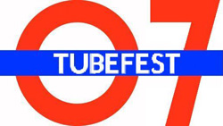
I'm probably going to play up the fact that this is the fifth annual event, so I thought it would be appropriate to use the number 5 as the basis for the logo. Obviously the roundel and the London Underground font are used too.
I also experimented with using that space at the top in some way, as follows: with the time to beat, cheesy film advertisement style, and my personal favourite.
I can't decide which one to go with, which is where you come in. Let me know which logo you think is the one to go with and what you think of the design idea in general. Feel free to come up with your own alternative logos and post them here too.
When a consensus has been reached, I'll finish the press release and post that here for your consumption too.
-Ollie


